!
How to make sure you have a perfect website for your startup?
byKarolina Czapla
Jan 03, 2024

The folks knocking on the doors of the Department of Web the most? Startups! In my time working at our web design agency, I’ve met brands that were diamonds in the rough but never took off. I’ve also seen some that flopped right out the gate, even with boatloads of cash backing ’em. And you know the kicker? They all had one thing in common…
Whenever we team up with a new client, we really emphasize the early stages of our chat. Getting everything out in the open from the get-go is our mantra.
After a decade in this biz, we know that laying out the game plan right at the start paves the way for a slam-dunk finish. Identifying the project’s main goals, understanding the target audience’s needs, their online habits, and a bunch of other jargon that flies over our startup pals’ heads.
So, when my marketing heart starts to ache, I sit ’em down and say, “Alright, thanks for sharing the big idea, but let’s rewind and start with your brand strategy.”
Today, I’m gonna spill the beans and share some tips and blueprints tailored for small startup bosses and business owners. These will help yall take a more critical look at your online presence. And give you a roadmap of what to zero in on and what to have ready before you hit up a software house for that killer website.
Does Every Startup Really Need a Website?
Bet you didn’t see that one coming, especially from a gal whose bread and butter is making websites! But real talk: have you ever stopped and wondered if you really need a full-blown website? What’s your reasoning, besides “everyone’s doing it” or “it’s just what you do”?
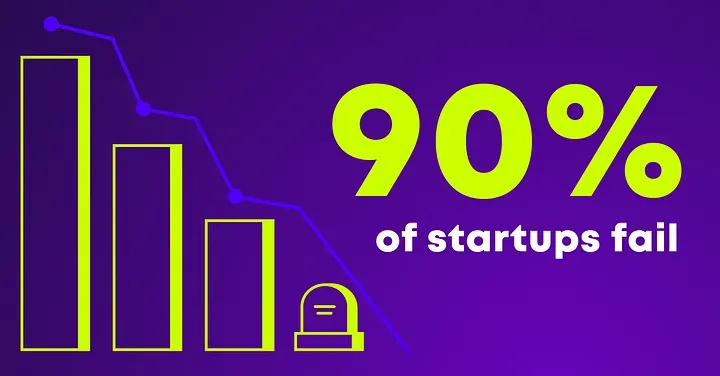
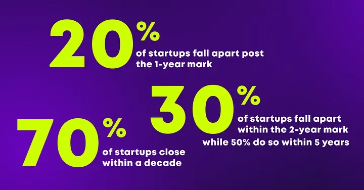
You know what clients say the darnedest things? But here’s a head-scratcher for you: data shows that 90% of startups tank in the first three months. Now, that’s a real noggin scratcher.
https://www.demandsage.com/startup-statistics
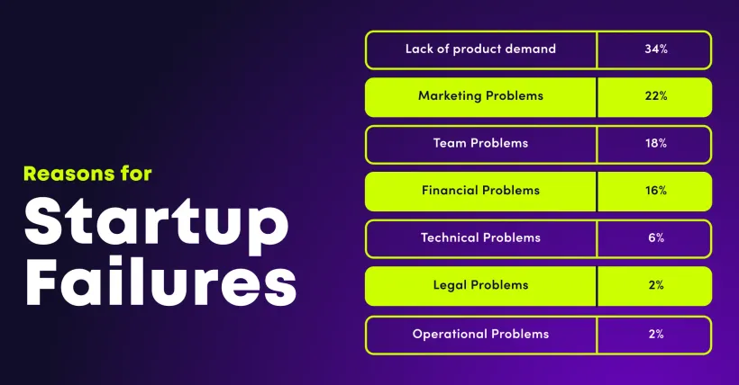
Makes me wonder: why? Sure, cash troubles, rookie mistakes, and messy processes might play a role. But having been in the game for so long, I can’t help but think a half-baked plan or no plan at all is the culprit.
https://www.demandsage.com/startup-statistics
Time to get back to the basics. Jot down these questions: who, what, why, and how.
For this article, let’s conjure up a buddy named Jon.
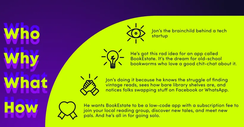
Does Jon need a website? I mean, he’s a tech guy, right? Websites are a given! Well, not so fast. Jon might just need a landing page with maybe a page or two more. Easy there, cowboy.
Hold onto your wallet and don’t get ahead of yourself. Be open, and like Seth Godin once said,
“You won’t get noticed until you learn to see.”
Where to Splash the Cash in Your Startup First?
Consumer research. Period. End of story.
Before you roll out a product, service, or brand, see if it jives with what the people want. If they don’t need it, why bother? Or maybe a little tweak here and there?
Consumer research might sound like big bucks, months of data collection, and analysis. If you got the green and the means, hand it off to the pros. But if you’re DIYing it, just get cozy with these three terms:
- Quantitative Research: All about number crunching. Great for spotting trends in a large crowd. Jon? Buddy could whip up a survey, share it with friends, and ask for a reshare. Dive into demographics, initial interest, and especially pain points. Questions like “Ever had a hard time borrowing a book?” or “How do you read books?”Watch out! Make sure your circle of friends isn’t your only pool. Results gotta be unbiased. Think of a filter question like “Do you read books?”
- Qualitative Research: This digs deeper into people’s motives and feelings. Here, Jon can refine questions, like “How far would you travel to grab a coveted book?” This phase is golden for honing in on target messaging, spotting what makes you unique, and rethinking promotion. Ask about what competitors are doing too.
- Focus Groups: A qualitative method where a bunch of peeps gather to dish about a specific topic, guided by a moderator. You’ll get a load of insights from the interactions.
Jon could handpick 10 from his survey respondents, ones that fit his user profile to a T, and delve into app design, functions, or even get feedback on a prototype.
Armed with notes, surveys, and feedback, dump all of it into a Value Proposition Canvas. Sketch out your brand, product, or service in line with your potential client’s needs. It focuses on what really matters to them. It’s a killer exercise for creativity, so good luck and knock ’em dead!
Why You Need a Landing Page and What to Pack In
Ever heard of a “landing page”? Think of it as the appetizer to your main course, or a sneak peek into your big idea. Before diving headfirst into your project, a landing page will let you test the waters to see if folks are biting. This is where a waiting list comes in handy.
Nothing beats the feeling of knowing someone’s eager to buy your product. With a pool of ready-to-go folks, it’s easier to kick off, gather insights, and build a tribe.
Landing pages? They’re your golden ticket to direct people who engage with your ads. These pages are tailored for action, cutting out all the noise that might distract from your message. And hey, make sure visitors instantly get where they’re at and what they can expect from you. Brace yourself for…
The Pitch Deck Lowdown
If you’re in the startup game, “pitch deck” should ring a bell. It’s a snappy presentation that offers potential investors or customers a flyover of your business plan, products, services, and growth trajectory.
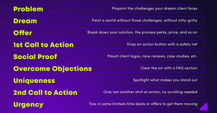
Now, you’ve got to nail that pitch deck on your site. Make it crystal clear so clients or investors catch your vision and see what’s in it for them. Feeling green and unsure about showcasing your idea? Everyone’s been there. Mastering this art takes time. Lucky for you, I’ve got a roadmap:
Props to Jonathan Stark for this blueprint. My early templates weren’t too shabby, but this one? Game-changer. Now, I often find myself plotting content based on Stark’s key.
https://jonathanstark.com/building-the-perfect-sales-page
There might be times you can’t fill every box. Been there, done that. But remember, the closer you stick to this guide when jotting down ideas, the smoother your site journey will be. Plus, you’ll have the lowdown on user behavior analytics. Ready to blend the pitch deck with Stark’s formula? You’re on track for some red-hot conversion rates.
The Universal vs. The Unique
Alright, quick tip when drafting content for your landing page: Make sure there’s real value behind those words. Separate the general from the gems. Stumped on how?
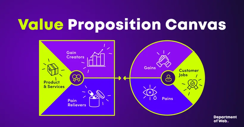
Revisit your value proposition matrix. Recognize your audience’s pain points? Your content should reassure them that you’ve got the perfect remedy.
Enter USP (Unique Selling Proposition) and UVP (Unique Value Proposition) — your cheat sheets to resonate with your target crowd.
Try crafting a sentence, jot it down, then dissect it to emphasize its core. Like, for an app called BookEstate, it could be:
“Discover a world of books right next door! Connect with neighbors, swap reads, and share thoughts, all within your community. BookEstate — your go-to local book club.”
For Jon’s communication, doubling down on the message is key. Break the sentence, wrap it around posts or website sections:
“Discover books nearby” — Jon can roll out video posts showing how to find books in the app, share stories of friendships made, or spotlight new book reviews or chats with authors. That’ll keep your peeps hooked and engaged.
If You Attract, You Don’t Need to Chase: The Power of UX
The digital realm is buzzin’ about two acronyms: UX & UI. And guess what? You should be, too. Why? Because your top goal is to reel visitors in and keep ’em glued to your site. But tread carefully!
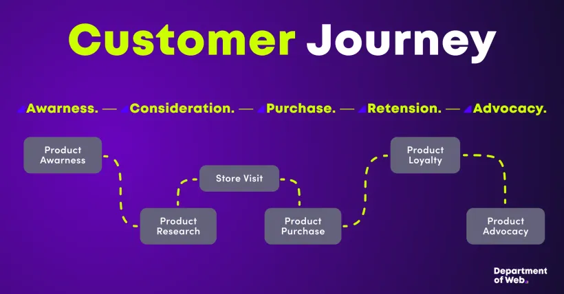
There’s a fine line between a rockstar site and a user’s worst nightmare. Many startups trip up by only jazzing up their site’s look, sidelining functionality and user-friendliness. Here’s the golden mantra:
“If you attract, you won’t need to chase.”
Make your site a breeze, and users will keep coming back. Nail it with these three tips:
1. Navigation
Keep it intuitive. Navigation should be a no-brainer. Clear menus, logical content groupings, and making sure users know where they’re at are the hallmarks of killer navigation. Ditch the maze of menu layers; ideally, everything’s just a click or two away. Stick to tried-and-true navigation blueprints. Don’t reinvent the wheel.
2. Clarity
Less is more, folks. Keep information neat and tidy. Users should instantly get where they are and what’s next on the agenda. Spotlight key elements and info but avoid overstuffing. Consistent typography, colors, and icons will help users get the gist of your content and layout.
3. Ditch the Glitz
In the design world, there’s a saying: “form follows function.” A snazzy design is rad, but not at the cost of usability. Ponder if that flashy animation or fancy design feature truly enriches the user experience or just throws them off. Overdoing the “glitz” can distract and slow down page loads — a double whammy bad for UX and SEO. Keep it simple and clear.
In a nutshell, when crafting a site for your startup, tune into your users’ needs and wants. Don’t bombard them with endless pop-ups or pushy ads. Woo them with functionality, clarity, and simplicity. Remember, ace UX doesn’t just make users happy — it’ll boost your bottom line.
Do Your Thing! And Don’t Be Scared to Delegate
Loads of startup founders daydream about big teams and Silicon Valley offices, seeing their business soar in a few years. But hey, assembling a team that fizzles out in a year because your idea wasn’t viable? Bummer, right? Every business is a gamble, but here’s the kicker…
You can build your empire in stages through outsourcing. By farming out stuff like branding, web design, ad materials, social media management, dev support, and more, you save time and often cash. Let the pros handle it, cut down risks, and leverage their expertise to pump up your biz.
How Can We Help?
Here at the Department of Web, we serve clients worldwide, crafting tailor-made websites and tech solutions. As I mentioned earlier, we’re all about diving deep into every phase of your product’s creation. From the discovery stage, where we familiarize ourselves with your product and refine the concept, to documentation and final delivery.
Rest easy; we won’t pull the wool over your eyes. If your vision’s shaky, we’ll either bolster it with our knowledge and experience or tell it to you straight. Transparency’s our middle name.
We’re a cozy team, but that means we give every project our all. Our client’s happiness and understanding of their needs? That’s front and center.
If you’re aiming to shake up the digital world with your solution in 2024, let’s make some magic together. Drop us a line!
Karolina Czapla
A Marketer who is slowly making herself at home in the world of WordPress and technology. She is adept at digital strategy, consumer research, and communicating with clients about technology brands. Her posts cover all the digital challenges facing users, as well as UX writing, benefit and value language, and social media communication tips.
Privately, a mother of 3 cats, always ready to provide her team with team-building and wellbeing experiences. A million ideas per minute and the colorful bird of our team.
